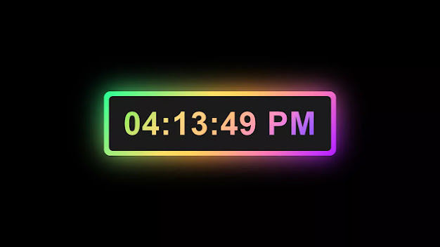
Hello readers, Today in this blog you'll learn how to create a Working Digital Clock with Colorful Glowing Effect using HTML CSS & JavaScript. Earlier I have also shared a blog on how to create a Digital Clock using JavaScript but in that clock, there wasn't a glowing effect and now it's time to create a colorful glowing effect on the digital clock.
A digital clock or watch in which the hours, minutes, and sometimes seconds are indicated by digits, as opposed to an analog clock, where the time is indicated by the positions of rotating hands. If you're searching for Working Analog Clock, I have also created a blog on how to create a Working Analog Clock.
In this program (Digital Clock with Colorful Glowing Effect), on the webpage, there is a digital clock which is displaying the real-time with a colorful gradient glowing background and text effect. Generally, this clock takes real-time from our pcs/computers not from the server and show on the webpage. Using Javascript new Date() method I fetched real-time from my current PC.
If you're feeling difficult to understand what I am saying. You can watch a full video tutorial on this program (Digital Clock with Colorful Glowing Effect ).
Video Tutorial of Digital Clock with Colorful Glowing Effect
In the video, you have seen the working digital clock which is displaying real-time and I hope you have understood the basic codes behind creating this program. As you have seen in the video, I used the only CSS to create a glowing background effect and animate it with the CSS @keyframes property. But to show the realtime I used pure JavaScript.
If you're a beginner, you can also create this digital clock or the glowing effect because there are no vast codes of CSS and JavaScript on this program. If you like this program (Custom Checkbox Design) and want to get source codes. You can easily get the source codes of this program. To get the source codes you just need to scroll down. You can use this Working Clock in your HTML pages and websites.
You might like this:
Digital Clock with Colorful Glowing Effect [Source Codes]
To create this program (Digital Clock with Colorful Glowing Effect). First, you need to create two Files one HTML File and another one is CSS File. After creating these files just paste these following codes in your file. You can also download the source code files through the given link. Click here to download source code files.
HTML File:
<!DOCTYPE html>
<!-- Created By CodingNepal -->
<html lang="en" dir="ltr">
<head>
<meta charset="utf-8">
<!-- Somehow I got an error, so I comment the title, just uncomment to show -->
<!-- <title>Digital Clock with Glowing Effect | CodingNepal</title> -->
<link rel="stylesheet" href="style.css">
</head>
<body>
<div class="wrapper">
<div class="display">
<div id="time">
</div>
</div>
<span></span>
<span></span>
</div>
<script>
setInterval(()=>{
const time = document.querySelector(".display #time");
let date = new Date();
let hours = date.getHours();
let minutes = date.getMinutes();
let seconds = date.getSeconds();
let day_night = "AM";
if(hours > 12){
day_night = "PM";
hours = hours - 12;
}
if(seconds < 10){
seconds = "0" + seconds;
}
if(minutes < 10){
minutes = "0" + minutes;
}
if(hours < 10){
hours = "0" + hours;
}
time.textContent = hours + ":" + minutes + ":" + seconds + " "+ day_night;
});
</script>
</body>
</html>
Css File :
*{
margin: 0;
padding: 0;
font-family: 'Poppins', sans-serif;
}
html,body{
display: grid;
height: 100%;
place-items: center;
background: #000;
}
.wrapper{
height: 100px;
width: 360px;
position: relative;
background: linear-gradient(135deg, #14ffe9, #ffeb3b, #ff00e0);
border-radius: 10px;
cursor: default;
animation: animate 1.5s linear infinite;
}
.wrapper .display,
.wrapper span{
position: absolute;
top: 50%;
left: 50%;
transform: translate(-50%, -50%);
}
.wrapper .display{
z-index: 999;
height: 85px;
width: 345px;
background: #1b1b1b;
border-radius: 6px;
text-align: center;
}
.display #time{
line-height: 85px;
color: #fff;
font-size: 50px;
font-weight: 600;
letter-spacing: 1px;
background: linear-gradient(135deg, #14ffe9, #ffeb3b, #ff00e0);
-webkit-background-clip: text;
-webkit-text-fill-color: transparent;
animation: animate 1.5s linear infinite;
}
@keyframes animate {
100%{
filter: hue-rotate(360deg);
}
}
.wrapper span{
height: 100%;
width: 100%;
border-radius: 10px;
background: inherit;
}
.wrapper span:first-child{
filter: blur(7px);
}
.wrapper span:last-child{
filter: blur(20px);
}


Nice
ReplyDelete