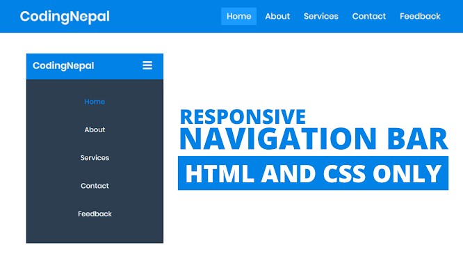
Hey friends, today in this blog you'll learn how to create a Fully Responsive Navigation Menu Bar using only HTML & CSS. In the earlier blog, I have shared how to create a Responsive Sidebar Menu using HTML & CSS and now it's time to create a navigation bar in html.
As you know the Menu Bar or Navigation Bar (Navbar) is important for any kind of website. Many websites have a responsive navbar or a responsive navbar with a dropdown menu. Essentially, responsive design is a way to put together a website so that it automatically scales its content and elements to match the screen size on which it is viewed. It keeps images from being larger than the screen width and prevents visitors from mobile devices from needing to do extra work to read your content.
In our design (Responsive Navigation Bar), as you can see in the preview image, there is a horizontal navigation bar or navbar with a logo on the left side and some navigation links on the right side. This is a very simple navigation bar and it is created using only HTML & CSS. The best part about this navigation bar is, it is fully responsive for any kind of device including mobile phones. On the pc, this navigation bar displayed in a horizontal line but on mobile devices, this navbar or navigation bar displayed in a vertical line. On the mobile, you have the option to show or hide the menu bar by clicking on the hamburger menu icon.
The concept behind shows or hide menu bar on menu icon click is simple. I used HTML <input> and <label> tag to show or hide menu bar. When the checkbox is checked and the menu bar is shown and when the checkbox is unchecked menu bar hidden. If you're feeling difficulty understanding what I am saying. You can watch a full video tutorial on this navigation bar in HTML.
Video tutorial of Responsive Navigation Bar in HTML
In the video tutorial, you have seen this is a pure CSS responsive navigation bar and I've used CSS @media property to make this navigation bar fully responsive for mobile devices. If you like this responsive navigation bar and want to get source codes of this program then you can easily copy the codes of this tutorial from the given copy boxes or you can also download the code files of this navigation menu bar.
If you're a beginner and you know a little bit of HTML & CSS then the codes and concept of this navigation bar will definitely help you to understand HTML & CSS more. This is a very simple responsive navigation bar with few and clean codes.
You might like this:
Responsive Navigation Bar [Source Codes]
Before sharing the source codes of this responsive navbar. Let's a few talks about the main tags and codes of this design. To create this responsive navbar I had used HTML & CSS only which means this is a pure CSS program. As you already know, this program is <ul> and <li> based design, that’s why we can create a menu or navigation links easily. I've used <input type="checkbox"> and <label for=""> tag to toggle menu bar in HTML for the mobile version. I also used the Fontawesome for a hamburger icon.
There are many things I left. Because I can't say all things in writing. I'm just talking about the main codes of this menu bar but don't worry you'll understand all the codes and concepts after getting the source code of this responsive navbar. To create this responsive navigation bar. First, you need to create two Files one HTML File and another one is CSS File. After creating these files just paste the following codes into your file. You can also download the source code files of this dropdown menu CSS design from the below download button.
HTML CODE:
CSS CODE:


